Pleco Mobile App Redesign - Branding
An iOs and Android App that is the standard for English to Chinese translation.
Pleco is named after the common fish, now found throughout the world, much like the two languages featured within the robust iOS and Android App. Although the fish is not originally found in Asia and has little to do with the spoken language of Mandarin, there is no substitute for brand recognition. The name should stay.
While the name stays, the icon cannot. It’s coloring and content simply do not speak to the user or relate back to China or Mandarin. The first choice is a simple one, prominently feature the color red, much beloved by the country and it’s people. Secondly, depict a more recognizably Chinese icon, the “Lion Dog” statues are commonly seen in China and in the United States and clearly harken back to the language and people in focus.

Pleco Mobile App Redesign - UX Design User Flow
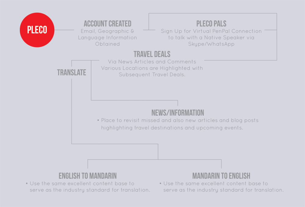
A detailed work flow depicting how the App is interfaced with, guides and directs users through features to clearly delineate design practices.

Pleco Mobile App Redesign - UX Design Prototype
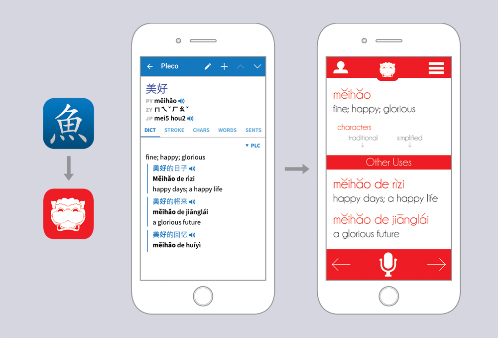
Functional prototype with traditional and simplified Mandarin definitions and usages, as well as spoken audio to properly communicate in a truly global language. While usable, the previous interface and experience leaves much to be desired, leaving the user, often times lost in a fully Mandarin version. There is also no ability to create a profile or focus on social interactivity, thus removing all marketing and sales opportunities. The Redesign places a heavier focus on social interaction and community while cleaning up the interface and usability.


