


Just Kidding Mobile App - Branding
An App for an online etailer specializing in toys, clothing and furniture for babies, toddlers and children, with a profound focus on handmade materials, constructed primarily in the USA in a sustainable manner.
A typographic App icon, written with a chalk inspired, child like font, denotes the feeling and attributes of youth. The lowercase “k” is subtle nod to the dimunitve nature of childhood and the necessity of its preservation. A natural, earth tone is used as the background color, reminding the user of the greatness in simplicity.
Just Kidding is word play on multiple elements. The term “kidding” is a reference to the now popular term “adulting” meaning to be an adult and do undesirable things. Yet, “kidding” is to focus on the purity and pleasure of being a child. Just Kidding can mean to simply be a kid, however there is a deeper meaning. “Just” meaning justifiable, righteous or correct, relates to the content. The user is purchasing items intended for the pure, purposeful and correct being of a child and all it entails.
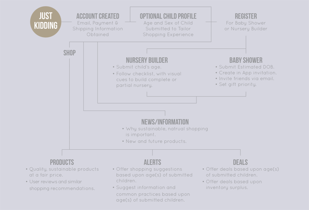
Just Kidding Mobile App - UX Design User Flow
A detailed work flow depicting how the App is interfaced with, guides and directs users through features to clearly delineate design practices.
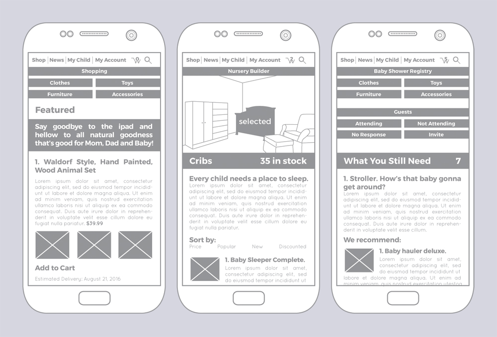
Just Kidding Mobile App - UX Design Prototype
Functional prototype where users are able to research, purchase and rate products that fit the “Just Kidding” parameters. “Waldorf” inspired toys and crafts are prominently featured as well real wooden toys from Scandinavia, using natural paints and finishes. There is also news and information as to why these things are important. The App also features a nursery builder.